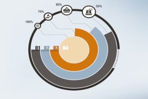
In a world bursting with data, visual storytelling has become more than just a design trend — it’s a communication necessity. Whether you’re a marketer presenting campaign results, a teacher explaining student performance, or a business analyst tracking quarterly trends, visuals make data easier to understand at a glance. Among the many ways to visualize information, pie charts have remained a staple for showing proportions, breakdowns, and comparisons.
But not all pie charts are created equal — and that’s where artificial intelligence (AI) is stepping in.
Today’s AI-powered tools are reshaping how pie charts are created, interpreted, and used. Instead of hours spent customizing visuals manually, creators can now generate, analyze, and optimize charts with far greater speed and intelligence. In this article, we’ll take a deep dive into how AI is transforming modern pie chart tools and why this matters for anyone working with data.
The Growing Demand for Smarter Data Visualization
Before AI entered the scene, creating pie charts was often a manual task — one where a user would collect data, choose colors, adjust labels, and fine-tune presentation details. This traditional approach works well for simple datasets, but it falls short when data gets complex, audience expectations rise, and reports need to be produced quickly.
As businesses collect more data than ever before, the need for tools that interpret data — not just display it — has skyrocketed. According to a 2024 survey by Dresner Advisory Services, 75% of organizations consider data visualization critical or very important for business intelligence strategies. At the same time, users report challenges with:
- Choosing appropriate chart types
- Ensuring visual clarity
- Avoiding misleading representations
- Generating insights from raw data
This data highlights a clear opportunity: tools that combine visualization with intelligence not only save time — they improve decision-making.
What AI Brings to Data Visualization
AI isn’t just a buzzword anymore. From automated text summaries to predictive analytics, AI is everywhere. And in the world of data visualization, its contributions are significant.
Here’s what AI adds to the process:
1. Automated Chart Generation
AI can analyze raw datasets and suggest the most meaningful visual formats — including pie charts — without user guesswork. This reduces human error and speeds up the creation workflow.
2. Intelligent Labeling and Color Choices
Choosing contrasting colors and readable labels can make or break a visual. AI systems can automatically assign palettes that meet accessibility standards and improve visual hierarchy.
3. Insight Extraction
More advanced AI tools don’t just draw charts — they explain them. AI can highlight major trends, call attention to anomalies, or generate narrative summaries that help users interpret what the data means.
4. Real-Time Updates
For dashboards and reporting tools connected to live data sources, AI can keep pie charts current — even when underlying metrics change dynamically.
The Evolution of Pie Chart Tools with AI
Gone are the days when you manually dragged shapes and adjusted values one by one. Modern pie chart maker has become a far more streamlined and intelligent experience.
In the middle of the workflow, AI enables tools to automate tedious tasks — from formatting to data cleansing — allowing creators to focus on insights rather than mechanics. Here’s what that looks like in practice:
Smart Data Preparation
Before generating visuals, data often needs cleaning — removing duplicates, correcting errors, and handling missing values. AI algorithms can preprocess datasets to ensure accuracy, saving hours of manual work.
Automated Chart Recommendations
Based on dataset structure and distribution, AI can suggest when a pie chart makes sense versus alternatives like bar charts or treemaps. This prevents misleading visuals and enhances comprehension.
Accessibility Optimization
AI tools can analyze contrast ratios and visual readability, ensuring that charts are accessible to users with visual impairments — a key consideration for inclusive design.
Narrative Enhancement
Some platforms now integrate AI-generated captions or summaries alongside visuals. Rather than leaving users to interpret numbers alone, AI provides context — for example, explaining why a segment is unusually large or flagging emerging patterns.
Real World Applications: How People Are Using AI-Enhanced Pie Charts
Let’s look at examples where AI-powered pie visualizations are making a difference.
Marketing Campaign Analysis
Marketing teams often work with datasets showing campaign reach, engagement, or revenue channels. With AI, these teams can generate pie charts that automatically group low-performing channels together, highlight shifts month-over-month, and suggest narrative insights that can be shared with stakeholders.
Education and Classroom Analytics
Teachers and administrators can use AI-augmented pie charts to show performance across subjects or demographic groups. Instead of manually calculating averages, AI tools can handle variations, generate chart updates instantly, and even recommend patterns worth exploring further.
Financial Reporting
Finance professionals need accurate, professional visuals to communicate budget allocations, expense breakdowns, and revenue sources. By incorporating AI, pie charts can be updated with real-time financial feeds and presented with dynamic summaries that help stakeholders make informed decisions.
Product Development Feedback
Product teams using customer feedback data can benefit from AI that clusters survey responses, visualizes sentiment proportions, and flags emerging concerns using pie charts alongside explanatory text.
Best Practices When Using AI Tools for Pie Visuals
While AI brings convenience, getting the most out of it still requires intentional strategy.
1. Know Your Data First
AI aids visualization — it doesn’t replace foundational data understanding. Always review key metrics before generating charts.
2. Choose the Right Scope
Pie charts work best when comparing parts of a whole. If you have too many categories (over 6–7), consider another chart type or grouping smaller slices into “Other.”
3. Validate AI Suggestions
AI can recommend insights — but human judgment should always validate them. Check for context and relevance.
4. Focus on Storytelling
Use AI-generated visuals as part of a narrative, not as standalone elements. Explain what the chart shows and why it matters to your audience.
5. Ensure Accessibility
Always apply accessibility checks — even if AI suggests color palettes. Contrast and labeling matter for inclusive design.
The Future of AI and Data Visualization
The trend toward AI-driven visuals isn’t slowing down. As machine learning models become more sophisticated, pie chart tools will likely integrate features such as:
- Predictive scenario visualization (forecasting outcomes visually)
- Voice-guided chart generation (turning spoken commands into visuals)
- Interactive animations that respond to user inputs
- Cross-platform integration with business intelligence systems
These advancements will make visual data creation more intuitive and accessible, not just to data experts but to anyone who works with information — from educators to entrepreneurs.
Wrapping Up
AI has fundamentally changed how we create and interpret visuals. What used to require manual effort and guesswork can now be automated, optimized, and enhanced with intelligent insights. For anyone working with data — whether in marketing, education, finance, or beyond — this evolution is a game-changer.
By leveraging AI-powered pie charts and visual tools, creators can save time, boost accuracy, and tell richer stories with their data. And as these tools continue to evolve, the gap between raw data and actionable insight will only shrink further.